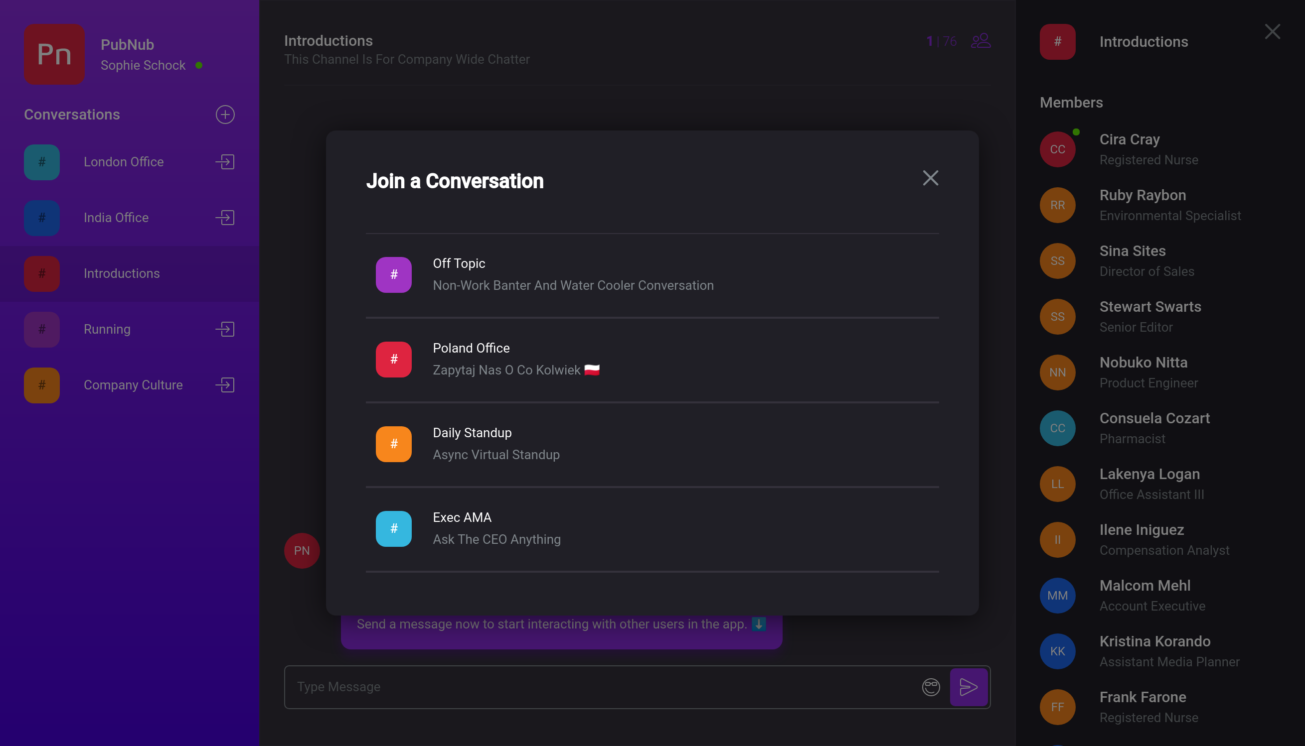
Theming the Application
Team Chat was built using the System UI theme specification.
The theme provides a single source of truth for sizes, fonts, colors, and other styles, which makes it possible to customize the look of the entire app by just editing the theme.
You can find the theme in src/main/Theme.ts.
Example: Dark Mode
Most of the themes is based on scales (arrays) of values for a property. These are combined with aliases that give the values easier to remember names and add an extra layer of control.
To start, replace the neutral colors with some dark mode colors in src/main/Theme.ts.
const colors = {
  error: "#B63133",
  success: "#50d133",
  inactive: "#E9EEF4",
  primary: ["#0168ff", "#0247ad"],
- neutral: ["#FFFFFF", "#F8F6FD", "#F1EDFD", "#9B9B9B", "#585858"],
+ neutral: ["#201f26", "#34313b", "#3c3845", "#80878c", "#FFFFFF"],
  avatars: [
    "#6b11d9",
    "#371bc2",
    "#612fbd",
    "#222bd4",
    "#1037e6",
    "#22943d",
    "#229485",
    "#227694",
    "#7d0c91",
    "#4a0c91"
  ]
} as const;
If you reload the app, you'll notice that the contrast in some areas isn't too great. We can fix that by swapping where the colors are applied by modifying the aliases.
const colorAliases = {
- onPrimary: colors.neutral[0],
+ onPrimary: colors.neutral[4],
  selectedText: "rgba(0, 0, 0, 0.5)",
  active: colors.primary[0],
- activeText: colors.neutral[0],
+ activeText: colors.neutral[4],
  messageText: colors.neutral[4],
  normalText: colors.neutral[3],
  importantText: colors.neutral[4],
- avatarText: colors.neutral[0],
+ avatarText: colors.neutral[4],
  borderLight: colors.neutral[2],
  borderDark: colors.neutral[3]
} as const;
Simmilarly, we can change the background for messages to add some more color.
const backgrounds = {
  primary: `linear-gradient(180deg, ${colors.primary[0]} 0%, ${colors.primary[1]} 100%)`,
  primaryHover: "rgba(255, 255, 255, 0.1)",
  primaryActive: "rgba(0, 0, 0, 0.1)",
  panel: colors.neutral[0],
  panelHover: colors.neutral[1],
  content: colors.neutral[1],
  contentHover: colors.neutral[2],
- message: colors.neutral[0]
+ message: colors.primary[0]
};
To maintain contrast, increase the strength of the shadows slightly.
const shadows = [
- "0 6px 10px rgba(103, 19, 176, 0.06)",
- "0 4px 30px rgba(0, 0, 0, 0.4)"
+ "0 6px 10px rgba(103, 19, 176, 0.4)",
+ "0 4px 30px rgba(0, 0, 0, 0.6)"
] as const;
Also change the extra data in custom to indicate this is a dark theme.
Most notably, this is neccessary to switch the emoji picker theme.
const custom = {
- dark: false,
+ dark: true,
  companyName: "PubNub",
  tagLine: "World-Class APIs for In-App Chat"
} as const;

Other Changes
There's a few things to change before you show off your chat app.
Change the Logo and Name
In the custom section of the theme, change the companyName. This affects the text displayed next to the logo in the top left corner.
To change the icon, replace src/foundations/components/icons/LogoIcon.tsx.
This is an React component which produces and SVG.
Eitheir replace the SVG with your own logo or delete the path elements to remove the PubNub text.
Change the Login Screen
The login screen lives in src/features/authentication/Login.
Updating the background image, app screenshot, and logo is as simple as replacing background.png, screenshot.png, and logo.svg respectively.
To update the tagline, edit the tagLine in the custom section of the theme.
Replace the Icon
The favicon and homescreen icon are taken from the public folder.
Replace logo512.png, logo192.png, and favicon.ico with your own icons.
Change the Meta Name and Description
The name of the app exists in the manifest and HTML template.
In public/manifest.json, change the short_name and name fields.
In public/index.html, replace the contents of the title tag.
To change the description, change the content property of the meta tag with the name description.
